Iconography
Icons and their usage principles were designed to communicate quickly and effectively across all touchpoints (from product to environment to marketing).
Taxonomy

System icons
Dimensional icons
Badges
System icons
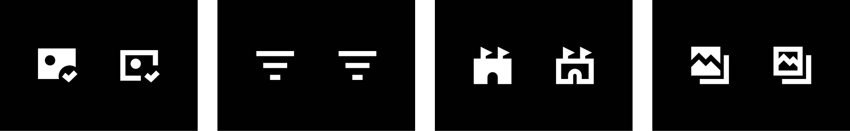
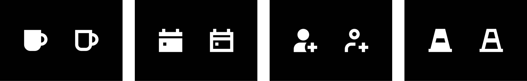
Our icon system is inspired by transportation iconography. It aims to be bold, communicative, and hard working. Each icon has an outline and fill version. Filled versions work well at small sizes in product while the outlined version works better in signage
and marketing.
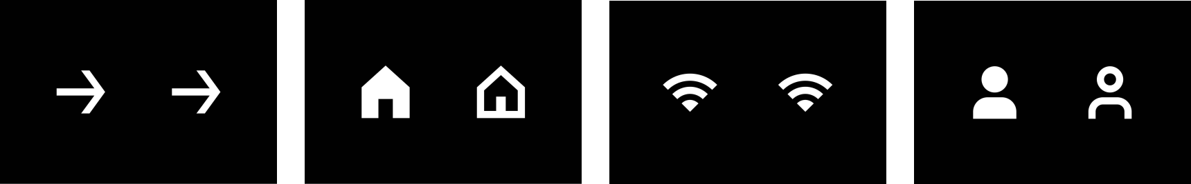
Move
Home
Wifi
Rider
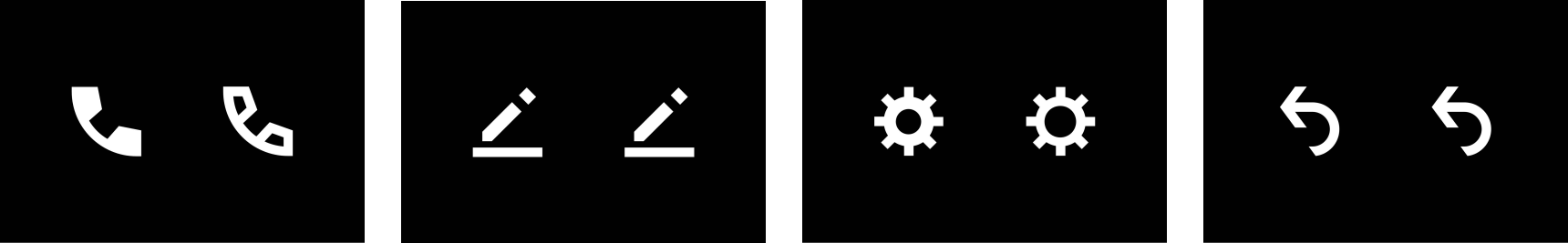
Phone
Signature
Settings
History

Star
Airport
Work
Vehicle
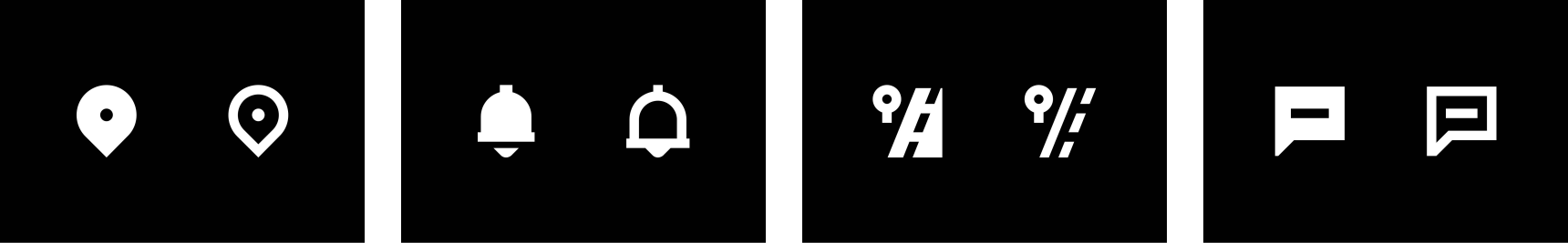
Location
Notification
Stop Left
Contact
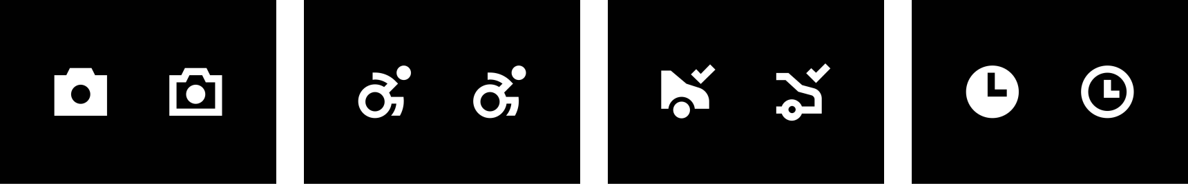
Camera
WAV
Arrive
Clock

Bus
Exit
Driver
Ferry
ID Check
Filter
Stadium
Photo Gallery

Shopping Cart
Clear Day
Report
Globe
Cafe
Schedule
Person Add
Accident
Construction
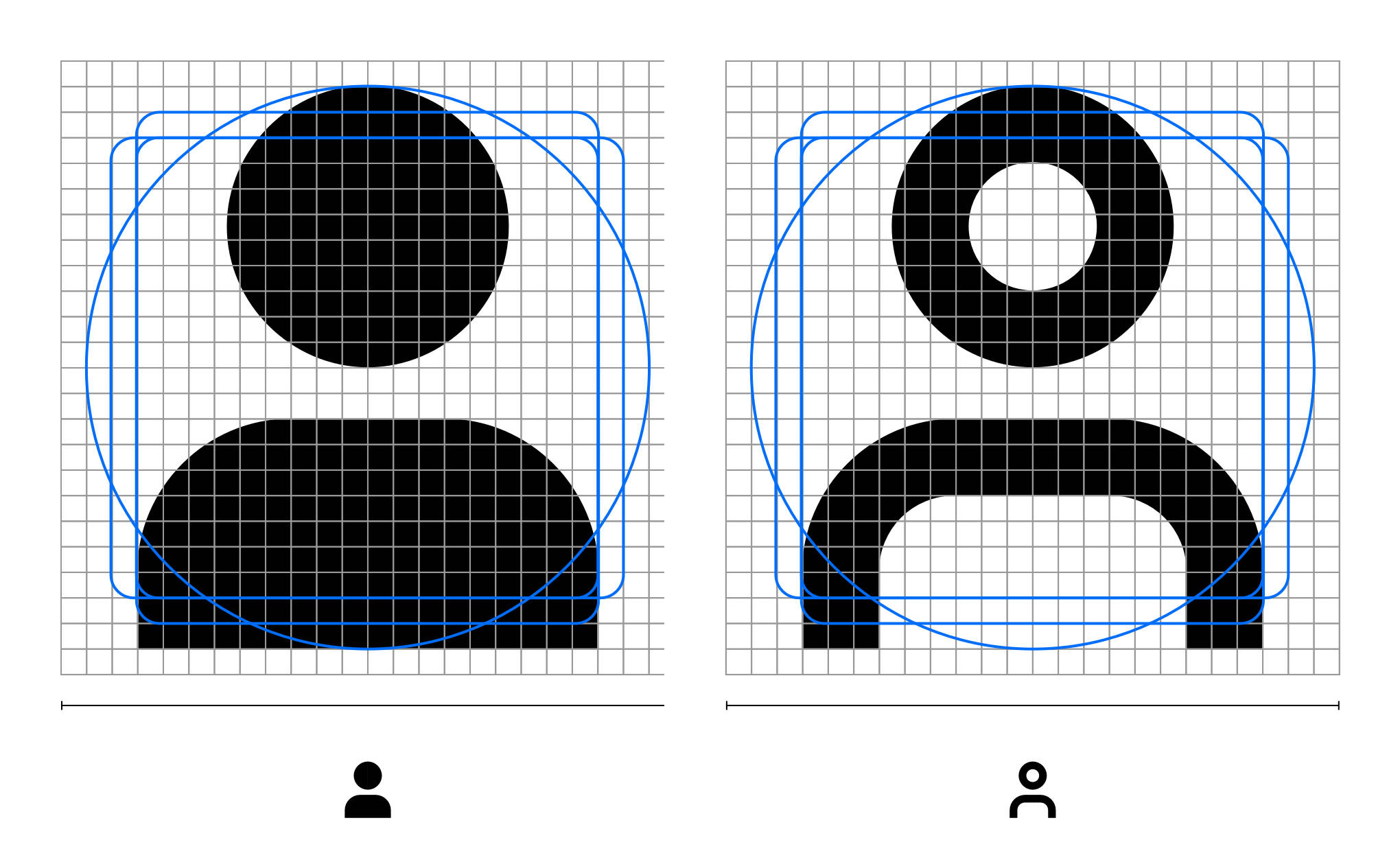
All icons should be drawn on a 24x24px grid frame, with a 3px stroke width for outlines. Each frame includes keylines and a one pixel padding on all sides as guidance. However, it’s acceptable to go beyond the padding or off the key lines if doing
so improves the optical balance of the icon.
Filled icon & Linear icon
24 x 24 grid
Container
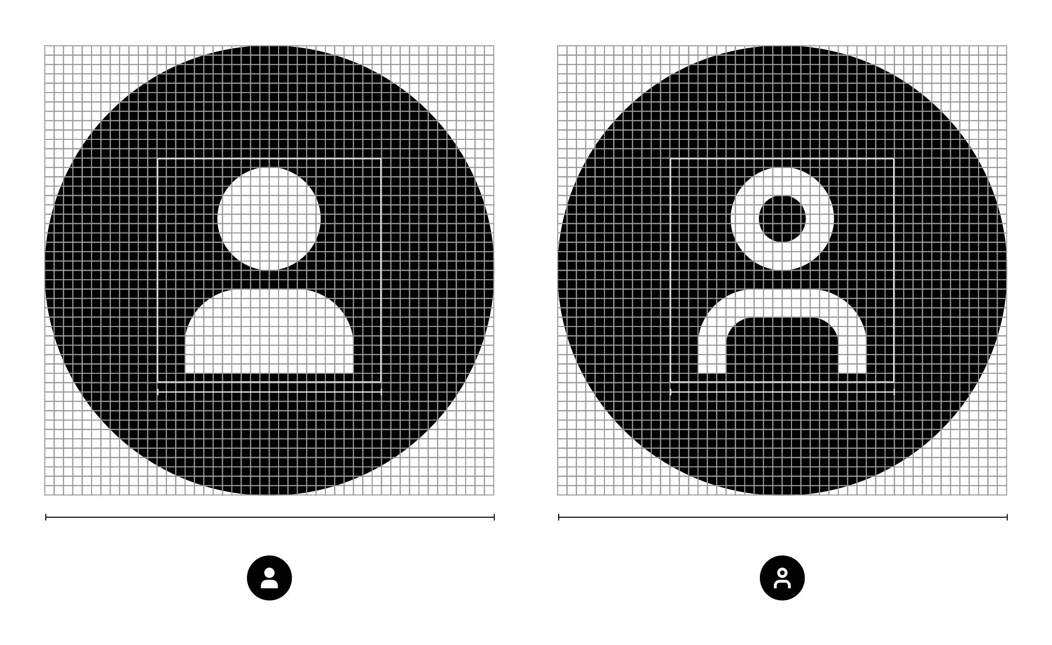
In cases where the icon is contained inside
a circle, the diameter of the circle can be determined by doubling the width of the icon. Icons should be optically centered within the container.
Filled icon & Linear Icon
2x (48x48 grid)
Dimensional icons
Dimensional icons are based on our system
icon language, specifically designed for usage
in cases such as VR and AR.
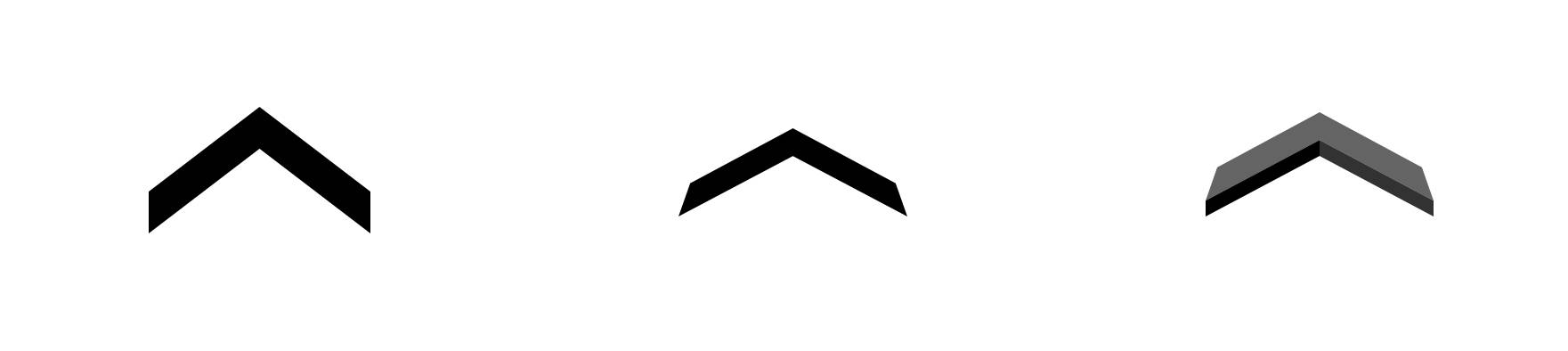
System icon
Skewed icon
Dimensional icon
Icon should be skewed based on the perspective of the generated environment
Dimensional icons should still feel graphic without skeuomorphic properties, using solid colors to differentiate the surfaces
Iconography applications
Iconography in marketing

Banner
Billboard
Web
Iconography in product

App
Notification and activity logs
Iconography Summary
Our icons are inspired by transportation
Iconography is functional and expressive
Build equity in the arrow