Logo
Optical kerning, refined weight, and defined clear space, as well as well delineated placement in relation to other content all help to make it as instantly recognizable as possible at all sizes and in all contexts.
Construction
Our logo is based on simple shapes. It is carefully constructed to maintain ownable characteristics while allowing for perfect legibility at any size on any application. The dynamic space between the U and the B is made possible by our kickstand U that has a vertical stroke descending from the right side.

Clearspace
Clearspace around the logo is equal to the cap height of the U.

Clearspace exceptions
The logo placement depends on the type of communication and use.
Color & scale
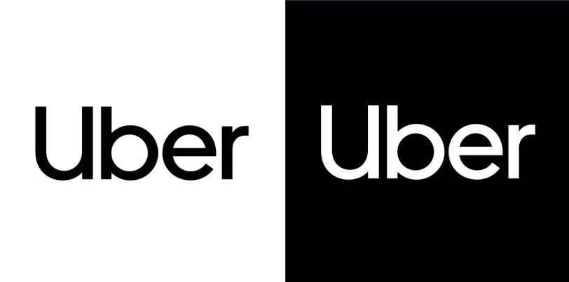
Logo should be white on darker backgrounds and black on lighter backgrounds.
Scale
Our logo is designed to scale to small sizes on print and screen.
Smallest size: 18 pixels wide/0.25 inch wide/0.635 centimeter wide.
Placement
The logo placement depends on the type of communication
and use.
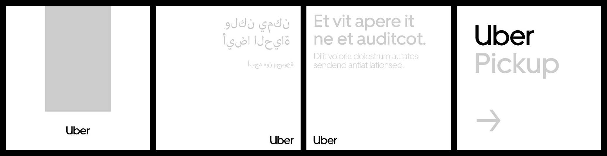
- CenteredCompositions using a Bold U-frame can be center aligned. Depending on the compositions image(s), logo can be placed either south of inset or north in composition.
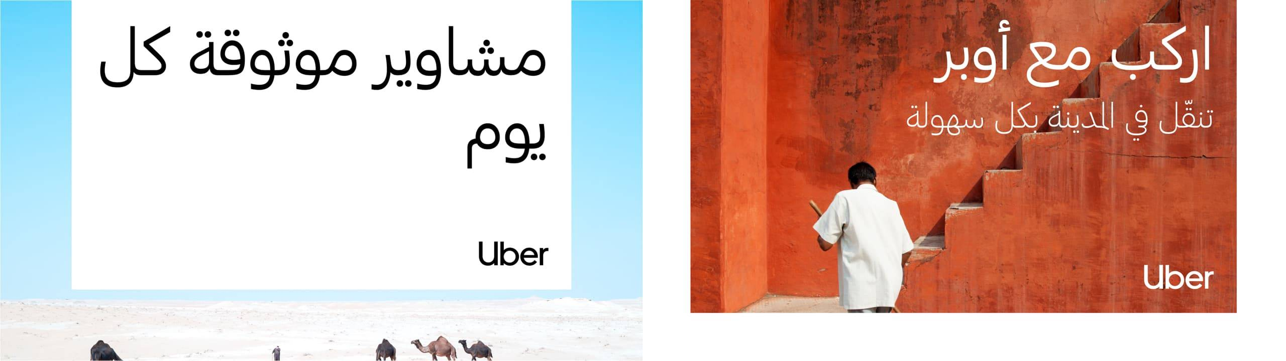
- Bottom rightCommunications in languages that read right-to-left: place logo bottom right of composition.
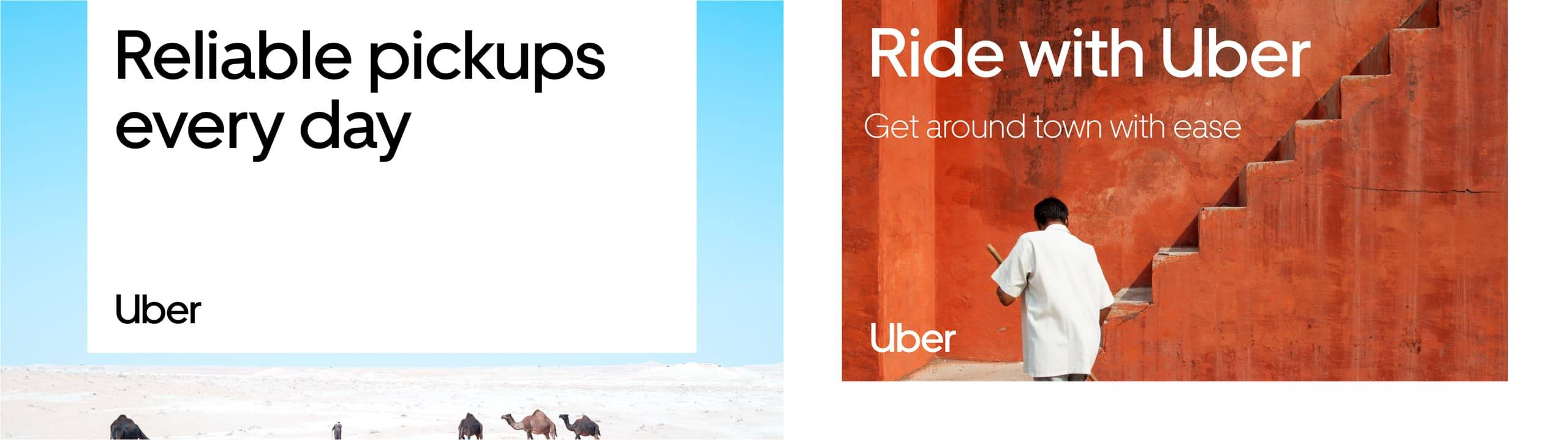
- Bottom leftGeneral communications that includes text, logo should be placed bottom left of composition.
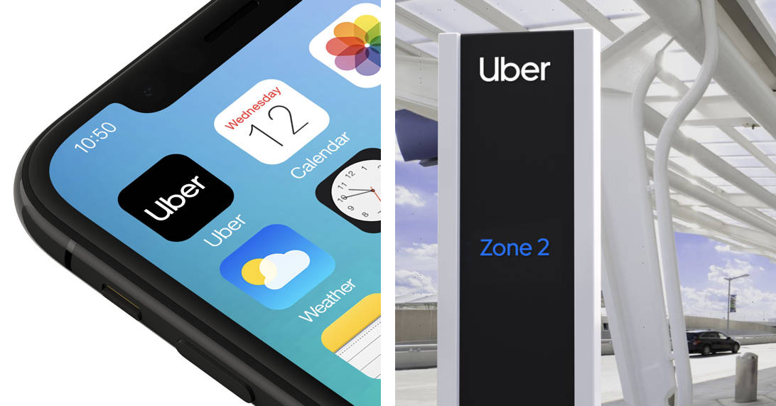
- Upper leftDigital communications such as call-to-actions and websites, as well as functional applications such as environmental signage: logo should be top aligned.
Partnerships
Aligning partnership logos should follow clear space rules.
The separating line between logos can be created either by
the vertical line glyph in the Uber Move Display Light at the same size as the logo.
Align partnership logos with product lockups by following same rules as brand partnerships.
- Vertical Lockup
- Horizontal Lockup
Social icons
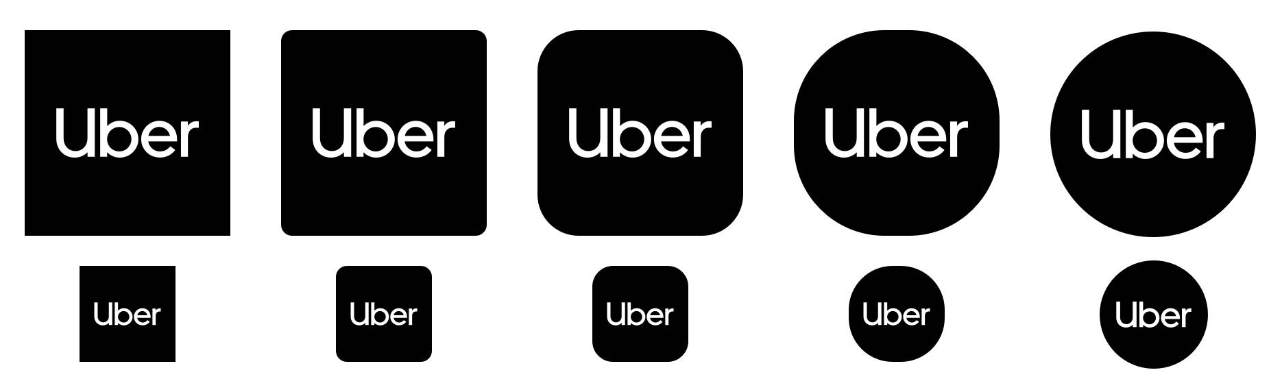
App icons are individually designed based on specifications.
They are an exception to the clearspace guidelines and are sized optically to best fit each shape.
Social icon construction
Align the logo center vertically and horizontally of the icon shape. Use half a horizontal U as the padding to the left and right edge of the icon shape.


Typeface as logo
The medium weight of Uber Move is the same weight as the logo however our logo has been optically kerned.
When a headline uses the word Uber, make sure to use the logo from the glyph pallet. If a logo is present outside of the headline, follow headline to logo sizing rules from the typography section of this document.
If space does not permit the logo and the headline to be present, the logo in the headline can act as the logo.
Logo guidance
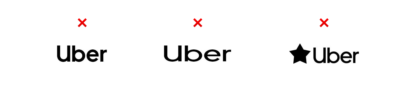
Use the Uber glyph, don’t type out Uber in other weights.
Don’t stretch or manipulate the logo.
Don’t pair the logo with marks that may be confused as logos.
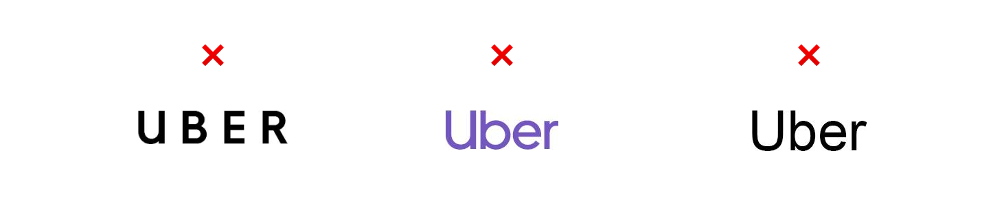
Don’t type out Uber in all caps or no caps.
Restricting use to only black or white affords us the highest contrast ratio, aiding accessibility.
Don’t type out Uber in any other fonts.
Logo Applications
Localization
In some regions you will encounter languages that read right
to left. Our system accommodates this.
Left to right
Right to left
Logo Summary
Simplicity rules
Consistent experience
Embrace the power of black & white