Logo
Guidelines and resources for using the Stack Overflow logo.
Stack Overflow

Logo Breakdown

Generally logo breakdowns can get a little silly, but in practicality, our logo’s spacing is based on the following dimensions and angles.
Our logo is broken down into two components, the glyph and its wordmark. These are often separated when displaying the full logo wouldn’t be appropriate. Examples of this include favicons, or logged-in headers. These are accessible in various pixel-locked sizes within our icons set and are available as
@Svg.LogoGlyph and @Svg.LogoWordmark.
Color Alternatives

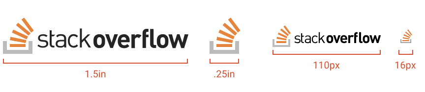
Minimum Sizes
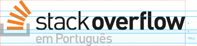
Community logo

Community Logo Breakdown
Community Logo Examples

Stack Overflow Meta
Stack Overflow Meta Breakdown
