Illustration
Our illustration style builds off the simple shapes of our logo and the transportation language background of our typeface.
Simple shapes, clean lines, limited color, and heightened reality give our illustration a branded feel and make it easy to digest and understand at a glance.
Principles

- Hyper efficientDo more with less by creating uncomplicated compositions
- Easy to understandEducating through bold telegraphic images
- Inspiring through metaphorEmbracing magical realism to create compelling images
Construction
Geometric construction
Illustrations are constructed using basic geometric shapes

Use of white and negative space
White is used strategically to allow more interplay between foreground and background

Types

Hero illustration
Used in high impact moments, and can be used
as background with overlaid copy.

Spot illustration
Used in smaller moments, usually paired with copy
as visual aidso that the content can be easily understood.

Badges
Badges are quick-read / literal illustrations focusing on one
main idea.
They are primarily optimized for email at 88x88px
Composition

- Activates negative space
- Pulls the eye to a central focus
Color Palettes
Specialty Colors
The specialty colors are designed only for illustrations that require tone-on-tone pairings and product designs that require variations of tone and opacity.

Color Palette

Warm 01
Warm 02
Cool 01
Cool 02
Blue
Color Palettes in Use
Warm & Cool

Safety Blue

Blue should be used to highlight key elements of safety
- Less blue is needed if white is dominant in the composition
- More blue is needed to offset other colors in a composition
Illustration Guidance

Do not use strokes
Do not use gradients

Do not use more than three colors in a single composition
Do not use transparencies or blend mode

Do not mix color palettes
Do not overuse black
Illustration Applications
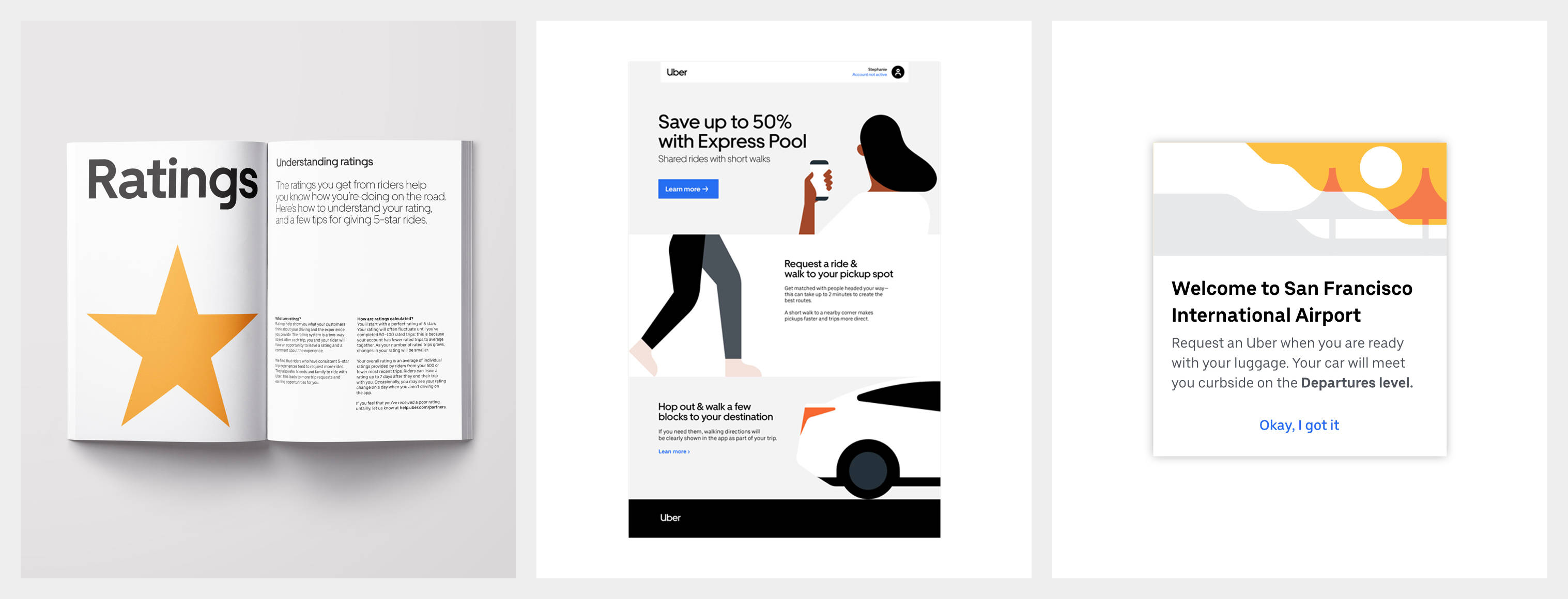
Driver Guide
Email
Product
Illustration Summary
Simple, bold, and telegraphic
Use of white for dynamic compositions
Use of blue in safety moments