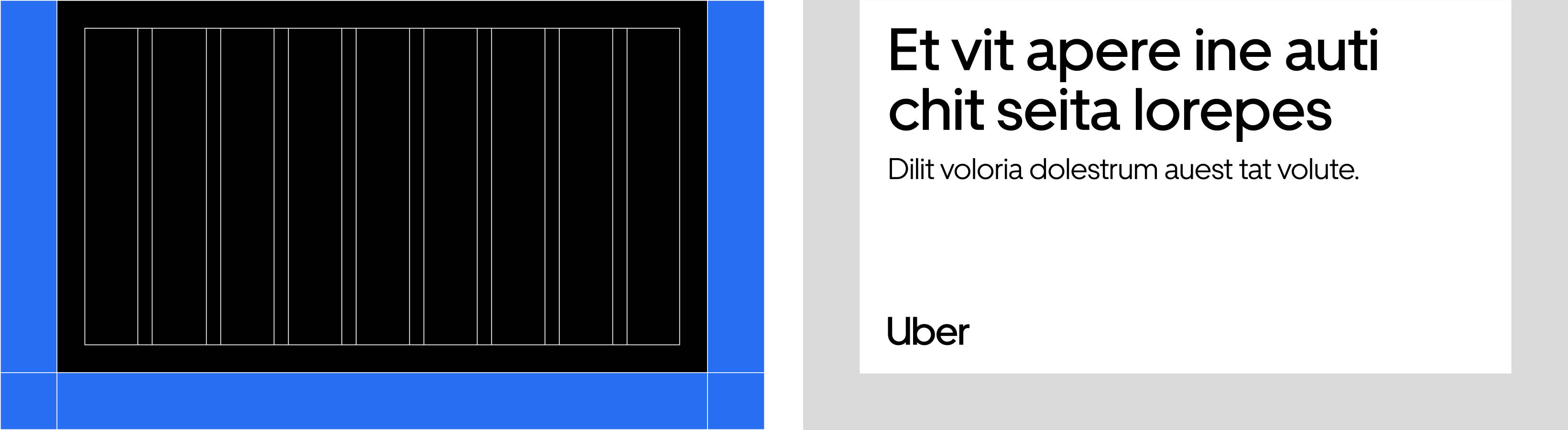
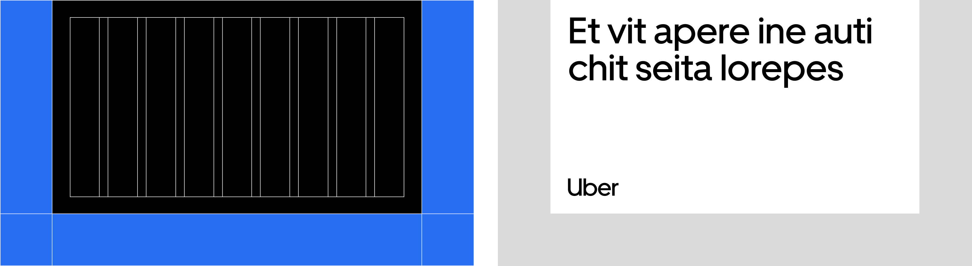
Composition
Our composition system is elegant in its sheer simplicity
of use—plus, it creates a subtle “U” wherever it appears. By defining the grid based on the logo (and exploring how columns scale across different sized compositions), the system stays flexible and beyond easy to apply. We’ve looked at different frame variants, how type works in different layouts, and are wire-framing our dynamic composition
web tool to prepare for the initial build.
Elements
Layout and U-frame
Grid guidance
Text and logo
Examples
Our composition story
The U-frame was conceived by extending the bit up which allows the negative space to create a supportive U-frame.
The bit
U
U, optimized for content
The U-frame

The U-frame
Uber Move (our typeface) — 4 weights

Light
Regular
Medium
Bold
U-frame — 3 weights
There is no light U-frame in the brand system

Regular
Medium
Bold
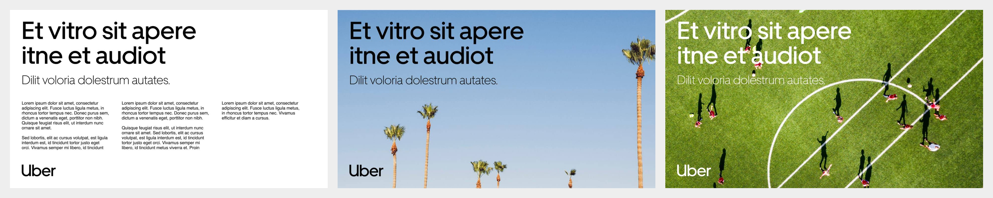
Compositional spectrum
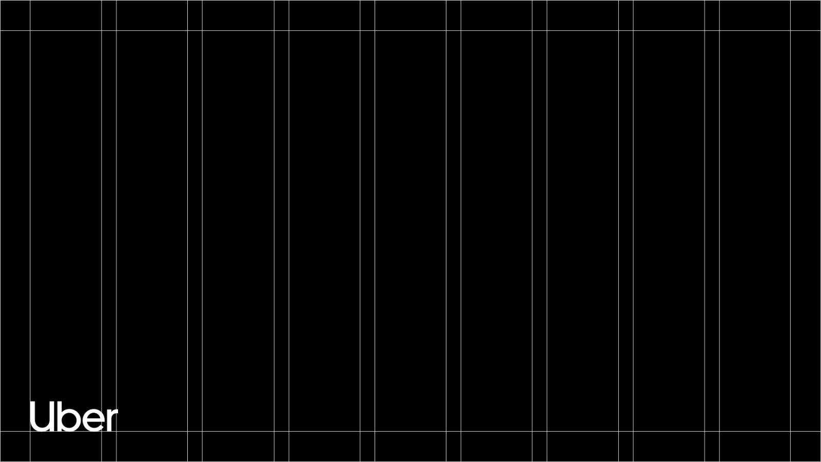
No U-frame, no logo (full-bleed)
No U-frame (full-bleed)
Regular U-frame
Medium U-frame

Bold U-frame populated
Bold U-frame
U-frame guidance
Production

- FormatIf your composition is very tall and skinny or very short and wide (like some banner ads), the U-frame will not work. The more real estate you have to play with, the more successful the U-frame will be.
- ContextMake sure that the context for your U-frame will provide sufficient contrast. For instance, if the composition is sitting on a black background, the U-frame should be white, or filled with a lighter color or image (otherwise the shape will disappear).

- ProductionFor printed assets:The U-frame requires a bleed and the ability to trim. If you are using a standard office printer and are unable to trim the final print, do not use the U-frame.
- ContentThe U-frame is generative and provides layout flexibility.


Layout
Layout variations
We have four frame variants. Content and format dictates the which layout to use.

1. Bold U-frame
2. Medium U-frame
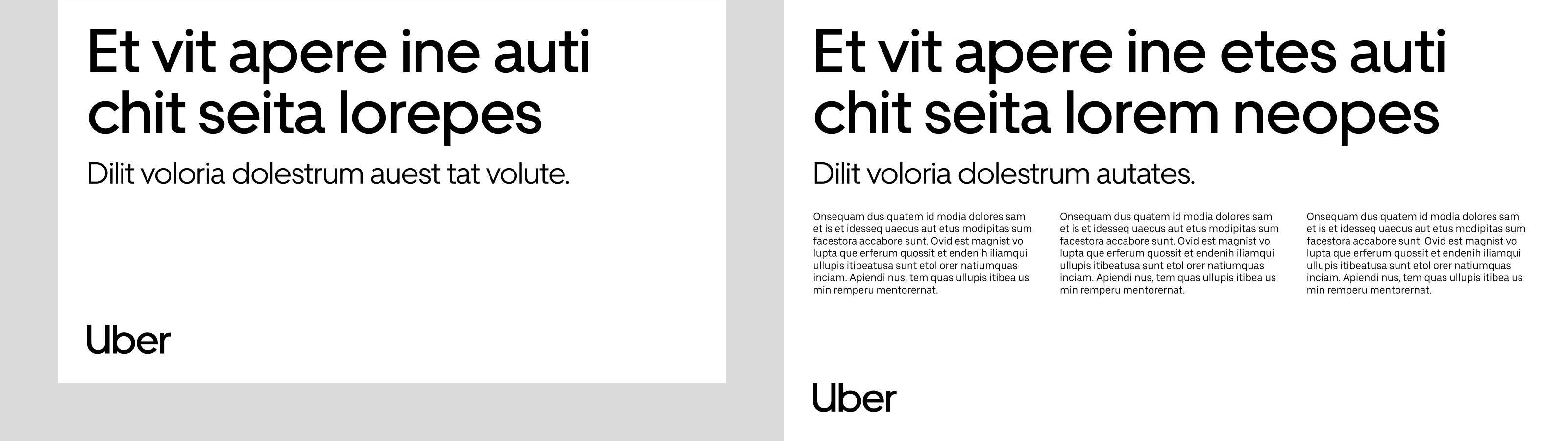
3. Regular U-frame
4. Full-bleed composition
Exceptional circumstances
In extreme instances when the formats are extended across print and digital applications use these frame variants.

5a. Split left
5b. Split right

6a. Extended U-frame left
6b. Extended U-frame right
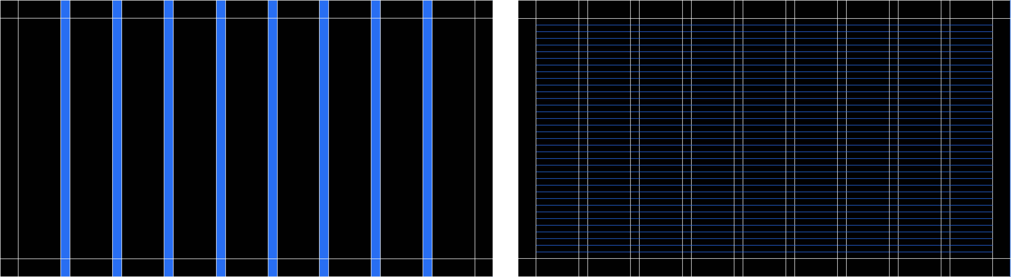
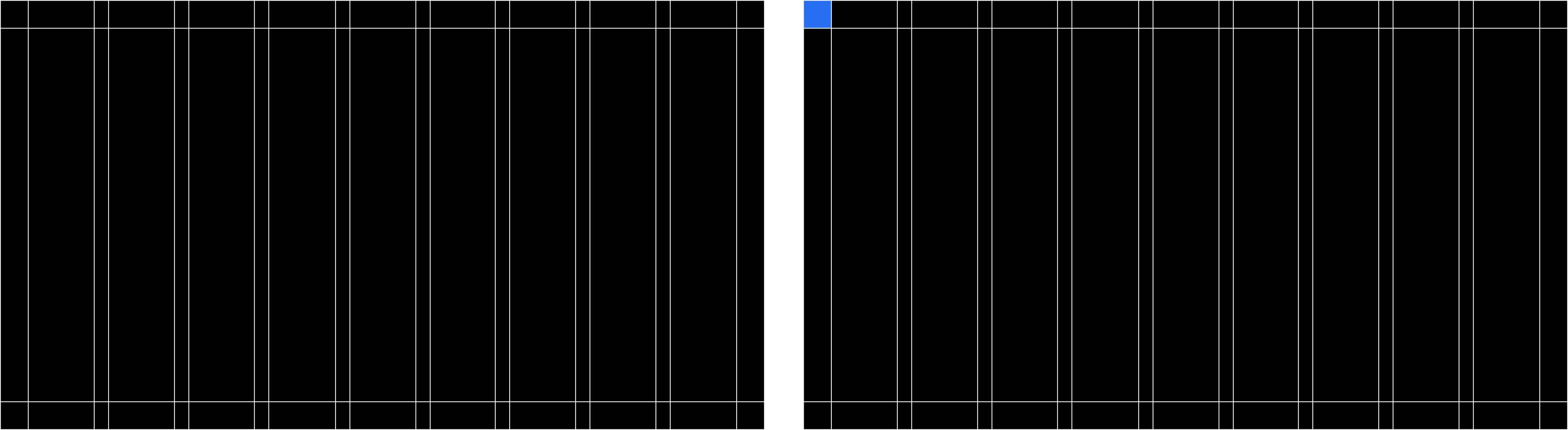
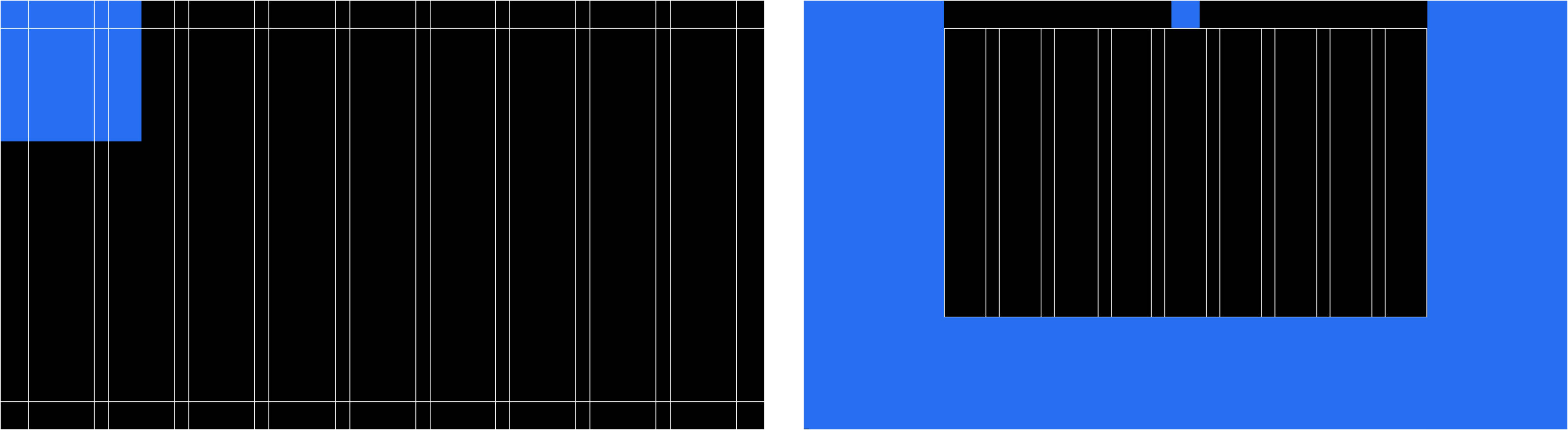
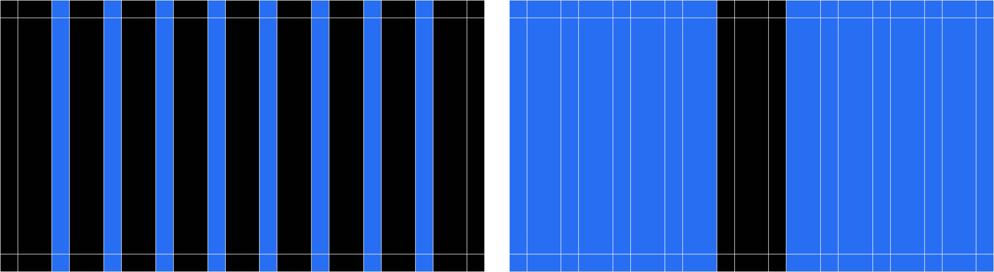
Grid Setup
Column breakdown

- 3-ColumnBanner ad

- 4-ColumnBanner ad | Event signage

- 6-Column
- 9-Column16:9 Presentation | All A sizes (horizontal) | Legal (horizontal) | Tabloid (horizontal) | Letter (horizontal)

- 12-ColumnBanner ad
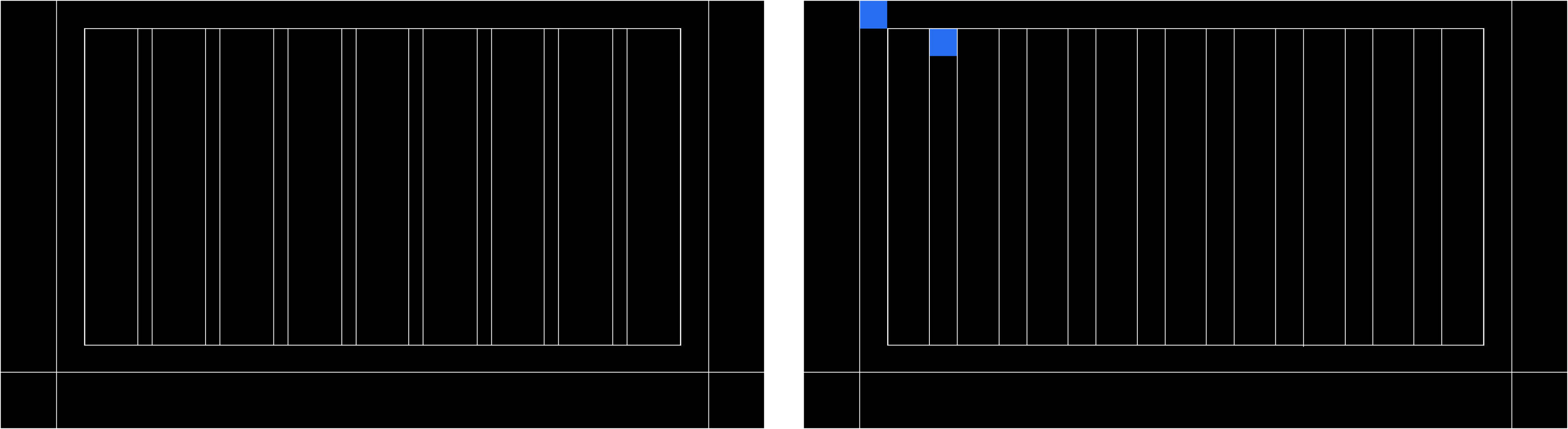
No U-frame (full-bleed)
For grid setup refer to page

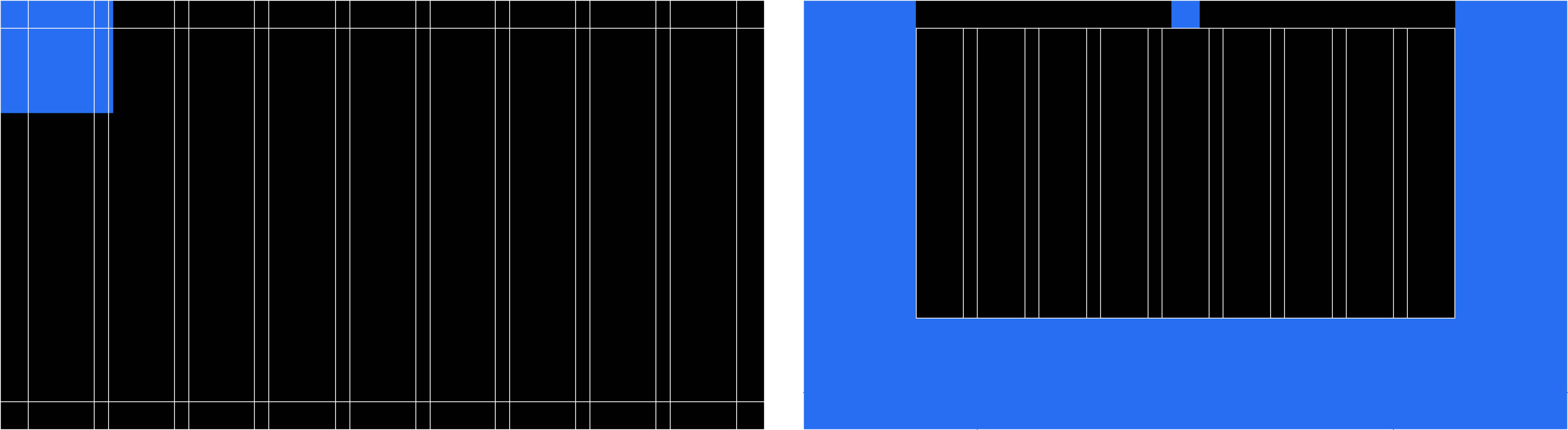
Base unit = 1U
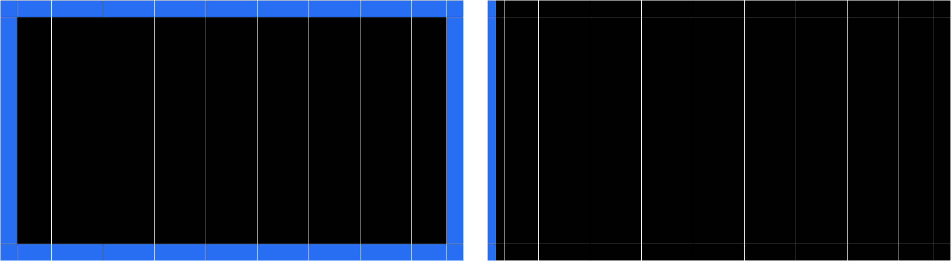
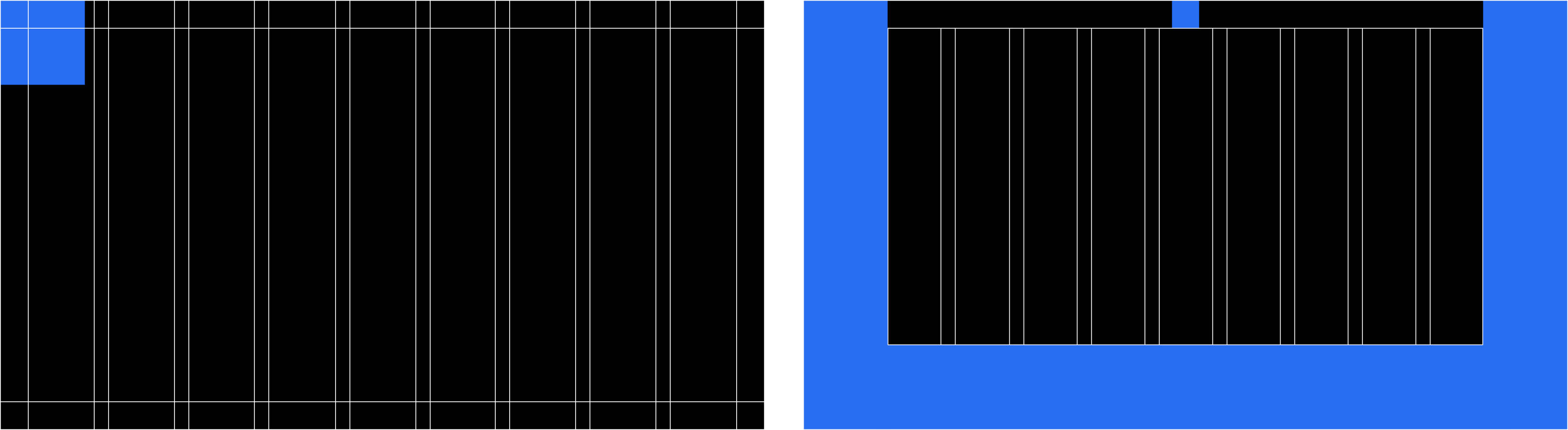
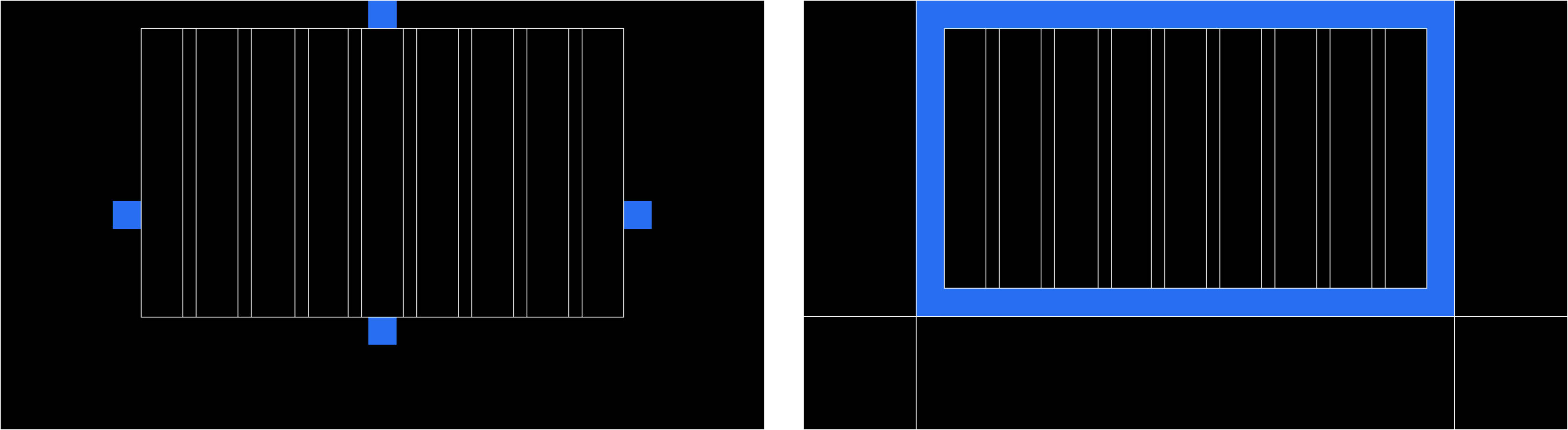
Regular U-frame
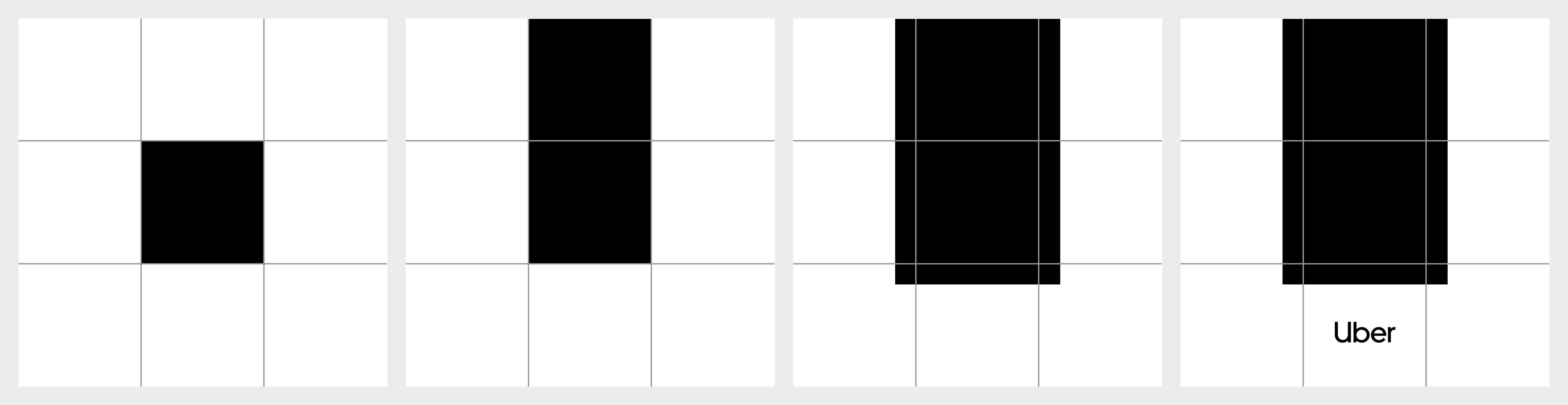
Basic grid + 2× base unit padding—
For grid setup refer to page

Base unit = 1URegular U-frame = 2U
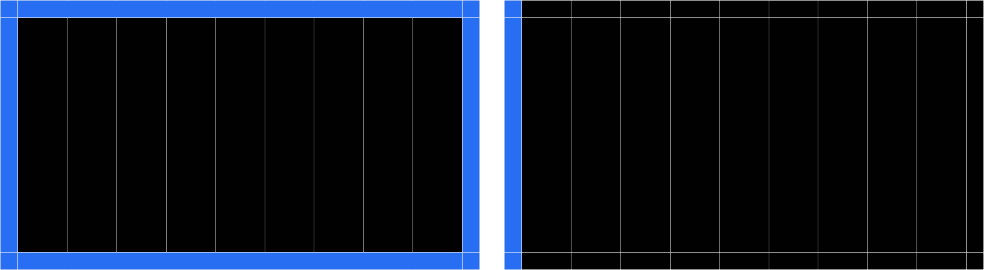
Medium U-frame
Basic grid + 3× base unit padding—
For grid setup refer to page

Base unit = 1UMedium U-frame = 3U
Bold U-frame
Basic grid + 4x base unit padding—
For grid setup refer to page

Base unit = 1UBold U-frame = 4U
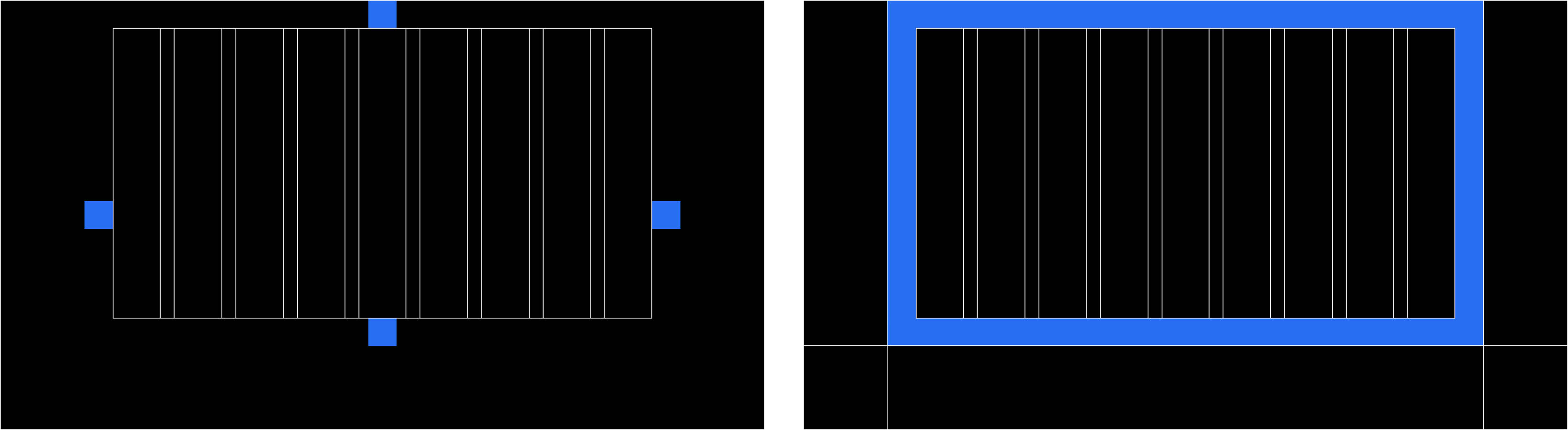
Full-bleed grid setup

- Define columnsBased on the column breakdown, determine the number of columns that makes the most sense for your composition. For a 16:9 presentation format, a 9-column grid works best.
- Define marginsOnce the columns are established, divide the width of one column into three even parts. 1/3 of the column width = margin and base unit width
- Equal margins on all sidesApply the 1/3-column margin to the top, right, bottom, and left of the composition.
- Define guttersOnce the margins are established, divide the width of the margin into two even parts. 1/2 of the margin width = the gutter width.
- Apply guttersThe gutter width should be consistent across the composition.
- Define rows (optional)Adjust the baseline grid in InDesign. The grid should be relative to margin top and the increment should match the leading of smallest type in composition (if contains 12/14 pt type, baseline grid should start at top margin and have gridline each 14 pts).
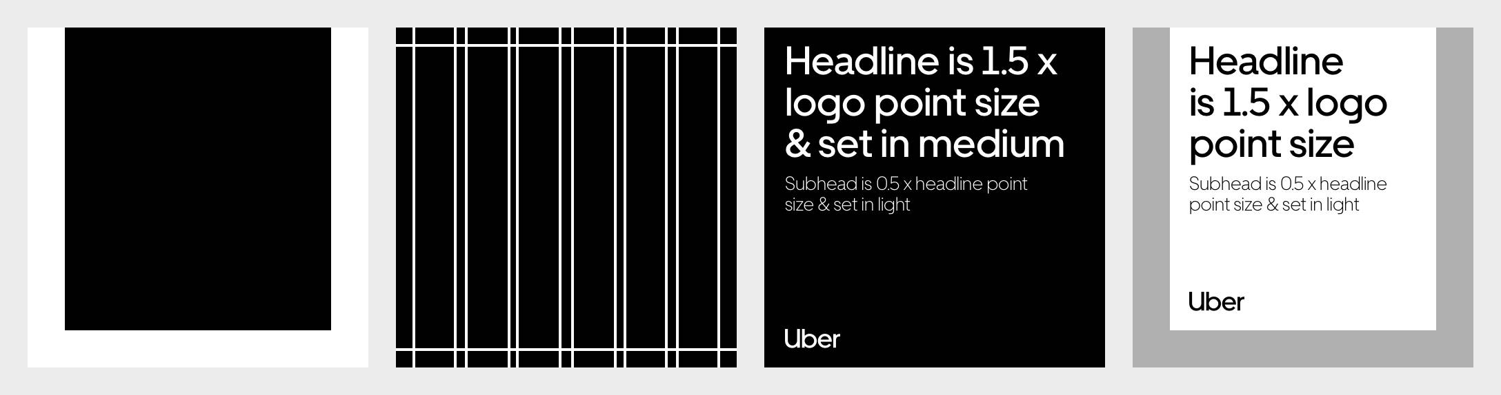
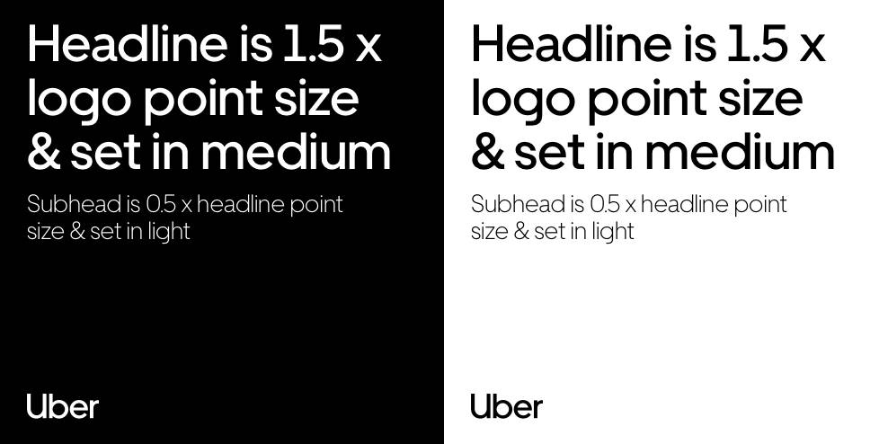
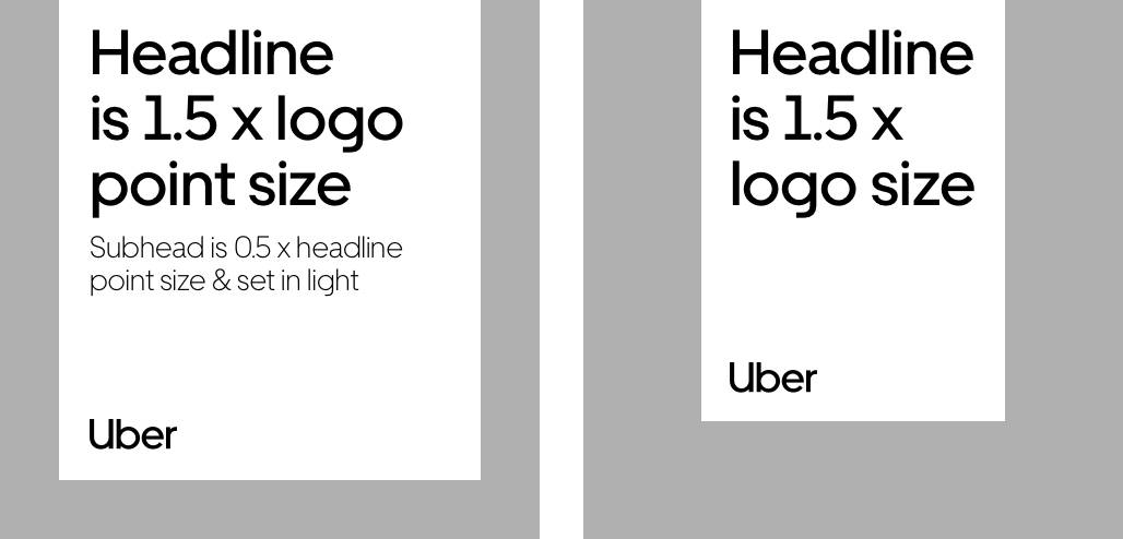
- Complete compositionLogo height = base unit height, headline cap height = 1.5× base unit height, and the subhead = 1/2 of the headline point size.
Regular U-frame setup

- Start with basic frame setupRefer to page
- Define base unit (margin width)The base unit = the basic grid margin width
- Define inner frame margin (3× base unit)Multiply the base unit width by 3
- Apply new margin (right, bottom, and left)Apply the 3× margin width to the right, bottom, and lefthand sides of your composition. Do not adjust the top margin.
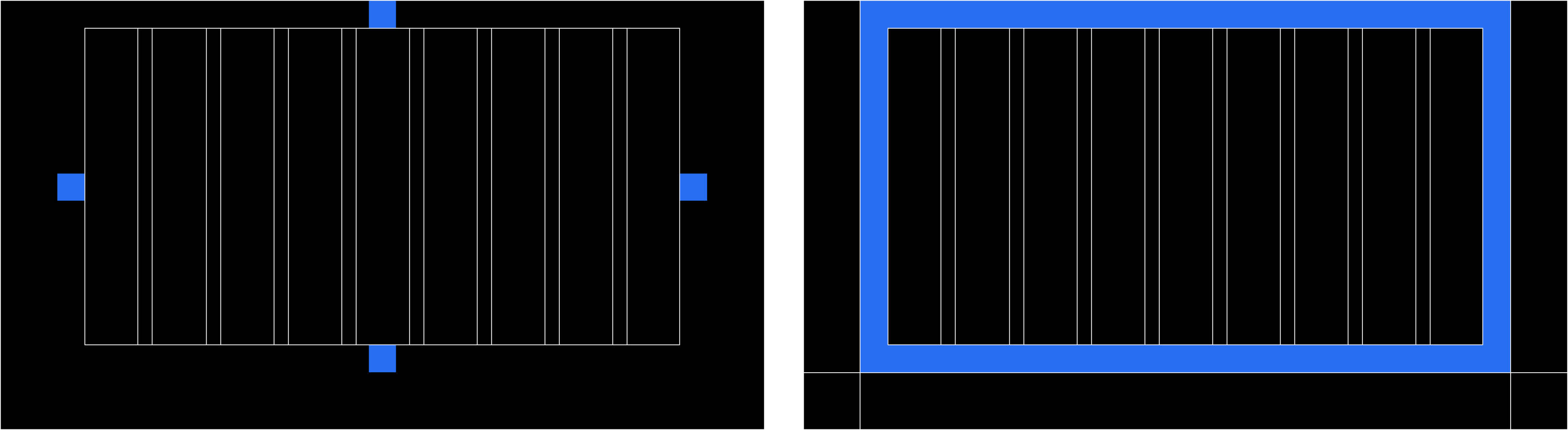
- Establish content padding (1x base unit)Once the new margins are established, create content padding by adding one base unit of padding to the outside of the margins on the right, bottom, and lefthand sides of your composition
- Apply content paddingThe padding should be even on all sides
- Fill U-frame and inset
- Complete compositionLogo height = base unit height, headline cap height = 1.5× base unit height, and the subhead = 1/2 of the headline point size.
Medium U-frame setup
- Start with basic frame setupRefer to page
- Define base unit (margin width)The base unit = the basic grid margin width
- Define inner frame margin (4× base unit)Multiply the base unit width by 4
- Apply new margin (right, bottom, and left)Apply the 4× margin width to the right, bottom, and lefthand sides of your composition. Do not adjust the top margin.
- Establish content padding (1x base unit)Once the new margins are established, create content padding by adding one base unit of padding to the outside of the margins on the right, bottom, and lefthand sides of your composition.
- Apply content paddingThe padding should be even on all sides
- Fill U-frame and inset
- Complete composition
Logo height = base unit height, headline cap
height = 1.5× base unit height, and the subhead
= 1/2 of the headline point size.
Bold U-frame setup

- Start with basic frame setupRefer to page
- Define base unit (margin width)The base unit = the basic grid margin width
- Define inner frame margin (5× base unit)Multiply the base unit width by 5
- Apply new margin (right, bottom, and left)Apply the 5× margin width to the right, bottom, and lefthand sides of your composition. Do not adjust the top margin.
- Establish content padding (1x base unit)Once the new margins are established, create content padding by adding one base unit of padding to the outside of the margins on the right, bottom, and lefthand sides of your composition.
- Apply content paddingThe padding should be even on all sides

- Fill U-frame and insetRefer to page XX for additional guidance
- Complete compositionLogo height = base unit height, headline cap height = 1.5× base unit height, and the subhead = 1/2 of the headline point size.
Split frame setup

- Define columnsBased on the column breakdown, determine the number of columns that makes the most sense for your composition. For a 16:9 presentation format, a 9-column grid works best.
- Define marginsOnce the columns are established, divide the width of one column into three even parts. 1/3 of the column width = the margin width.
- Equal margins on all sidesApply the 1/3 column margin to the top, right, bottom, and left of the composition.
- Define guttersThe margin width is your new gutter width.
- Apply guttersThe gutter width should be consistent across the composition.
- Snap image block to left or right marginApply the 1/2 margin gutters to the composition. The gutter width should be consistent across the composition.

- Complete compositionObey the margins and gutters when placing text into the composition. The logo should snap to the margin (as it does with the basic grid)
- Complete Composition Cont'dLogo height = base unit height, headline cap height = 1.5× base unit height, and the subhead = 1/2 of the headline point size.
Extended U-frame setup
- Start with Regular U-frame setupDo not use the Medium or Bold U-Frame an extended U-frame composition
- Establish new gutter width (1× base unit)The gutters should be the same width as the margins

- Snap image block to left or right marginThe image block an sit on either the left of the righthand side, but should snap to the Regular U-frame grid margins. Obey the margins and gutters when placing text into the composition
- Complete compositionThe logo should snap to the bottom of the image block (not the inset margin)
- Complete - Composition Cont'dLogo height = base unit height, headline cap height = 1.5× base unit height, and the subhead = 1/2 of the headline point size.
Composition Guidance
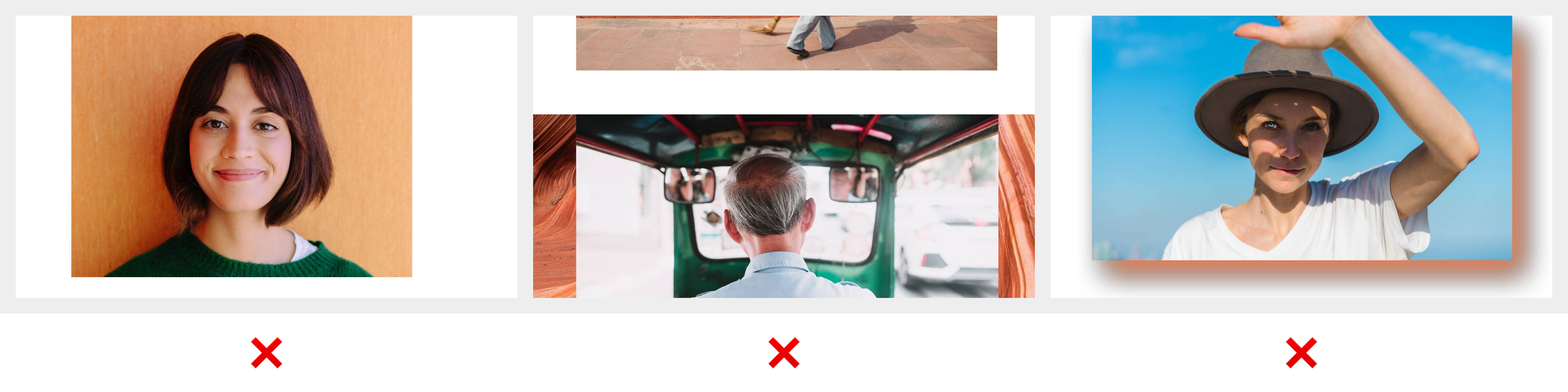
Image on image
Image on image compositions are designed to tell deeper visual stories. Imagery used in the U-frame should be simple and never complex or distracting. Background images should be textural to allow the image in the frame to pop.

A -> B
Different perspectives
Origin stories
Telling stories of someone’s journey from one place to another.
Showing different perspectives or directions of the same event.
Giving textural reference to someone’s place of origin.
Image on image guidance
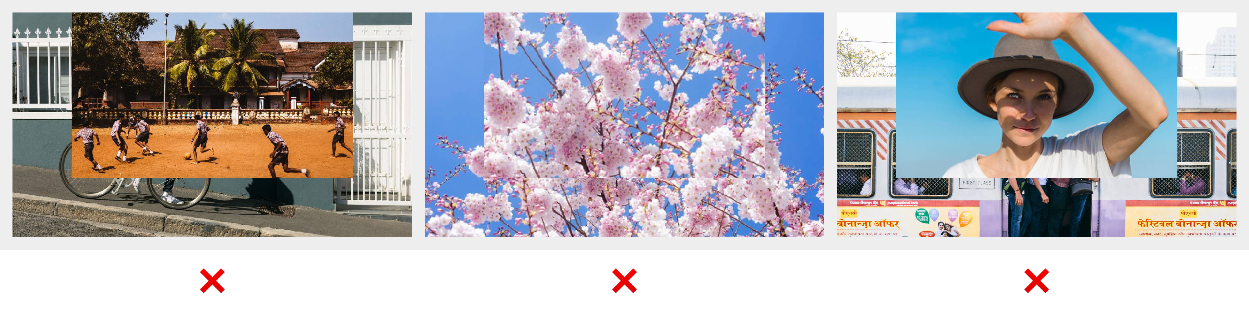
Composing complex images together
Using the same image for both U-frame and inset
Connecting images that don’t match or are not associated with each other
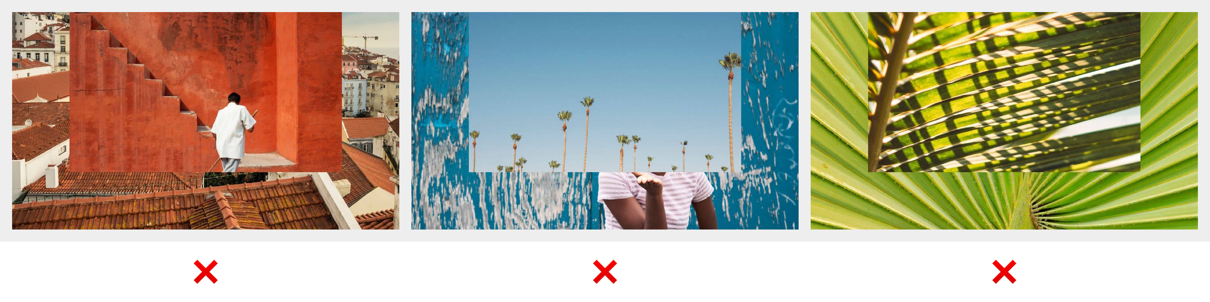
Color in both images are similar so the U-frame becomes undistinguishable
Crop important elements in the image that should be shown or use image for U-frame that should be inset
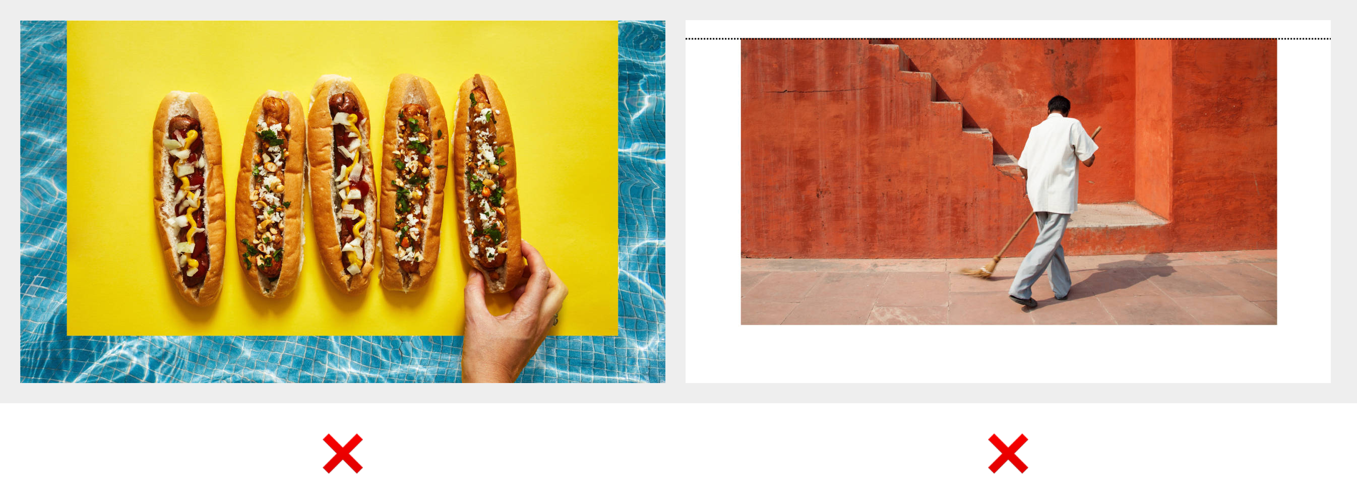
Similar images that don’t demonstrate a strong enough story to use image on image compositions
Composition overview
Bold U-frame

Medium U-frame

Regular U-frame

Split U-frame

Full Bleed U-frame
Composition guidance
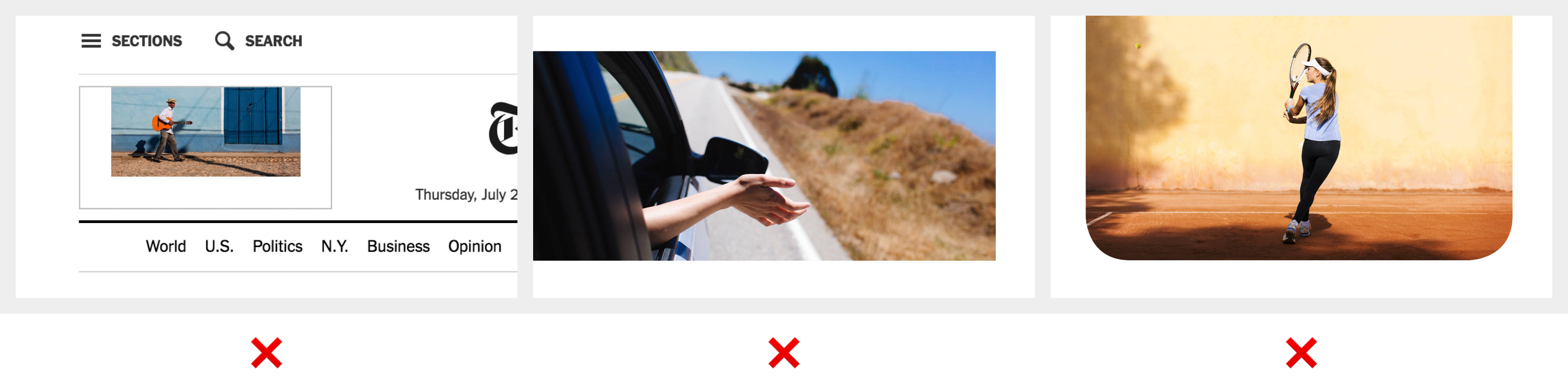
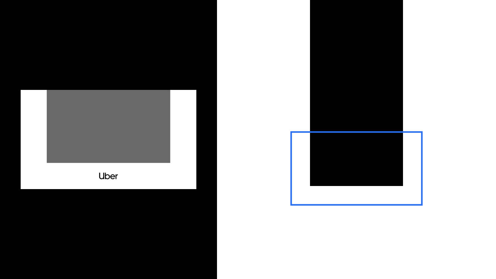
Avoid using the U-frame in contexts without sufficient contrast.
Do not rotate the U-frame (it will not longer resemble a U).
Do not round the corners of the U-frame.
Do not create uneven U-frames, at least two sides must be equal. (The partial U-frame is the exception to this rule).
Do not use multiple U-frames within a composition.
Do not add special effects to the U-frame.
Do not break the U-frame.
Do not use the U-frame if full-bleed is not possible.
Composition Applications

Banner ad


Composition Summary
- Content dictates the format
- Don’t force the U-frame
- Reserve U-frames for key moments