Typography
Our typography is as unique and easy to use as we are. Inspired by the world’s best used transportation examples,
it was designed to maximize its impact across all applications while keeping it easy to read, ownable,
and highly recognizable. Its name: Uber Move.
Uber Move
Uber Move is a key element in our brand.
It works to maintain consistency, create clarity, and provide equity to the brand as a global leader in multi-modal transportation.
UberMove


Pairings
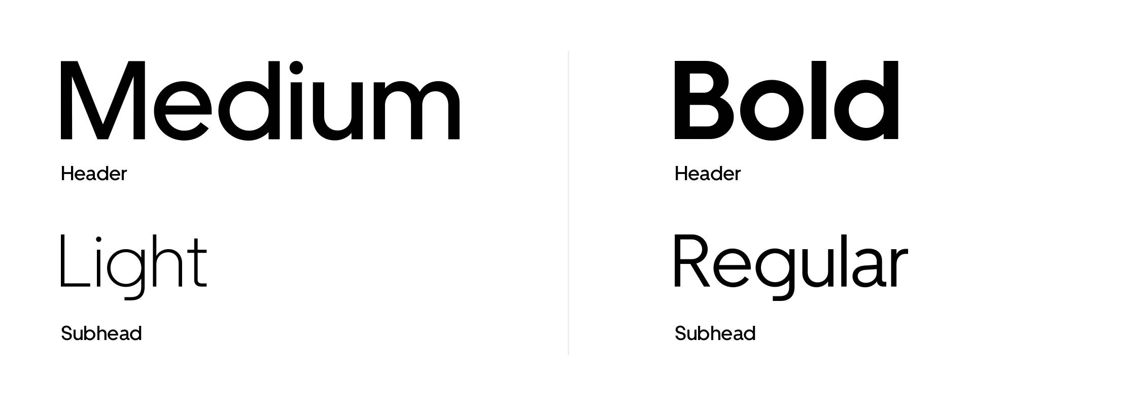
It is important to maintain these type pairings. This allows for clarity, consistency, and a strong hierarchy for all communications. Medium weight should be paired with Light weight, and Bold weight should be paired with Regular weight.
Options
Hierarchy
Examples
It is important to organize typography in
a hierarchical system according to relative importance or inclusiveness through scale
and function depending on communication.
- Awareness
- Consideration
- Action

Headline
Uber Move Display Medium
Cap height = 1.5× base unit height1.0/ 100% leading0 tracking6 words or more
Subhead
Uber Move Display
Light½ headline point size1.1/110% leading0 tracking
Logo
Logo height = base unit height(refer to grid setup section of this document)

Headline
Headline Uber Move Display Bold
5 words or lessCap height = 1.5× base unit height1.0/ 100% leading0 tracking
Subhead (optional)
Uber Move Display Regular
½ headline point size1.1/110% leading0 tracking

Headline
Uber Move Display Medium
6 words or moreCap height = 1.5× base unit height1.0/ 100% leading0 tracking
Subhead
Uber Move Display Light
½ headline point size1.1/110% leading0 tracking
Body copy
Uber Move Text Regular
⅓ subhead point size1.2/120% leading0 tracking

Headline
Uber Move Display Bold
3× body copy point size1.0/100% leading0 tracking
Body copy
Uber Move Text Regular
⅓ headline point size1.2/120% leading0 tracking

Headline
Uber Move Display Medium
2× body copy point size1.0/100% leading0 tracking
Body copy
Uber Move Text Regular
½ headline size point size1.2/120% leading0 tracking

Headline
Uber Move Text Regular
1× subhead point size1.2/120% leading0 tracking
Body copy
Uber Move Text Regular
1× headline point size1.2/120% leading0 tracking
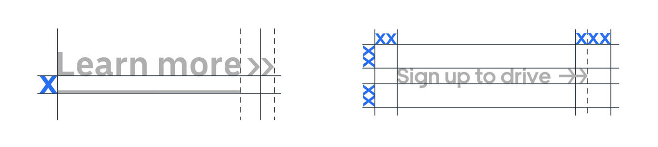
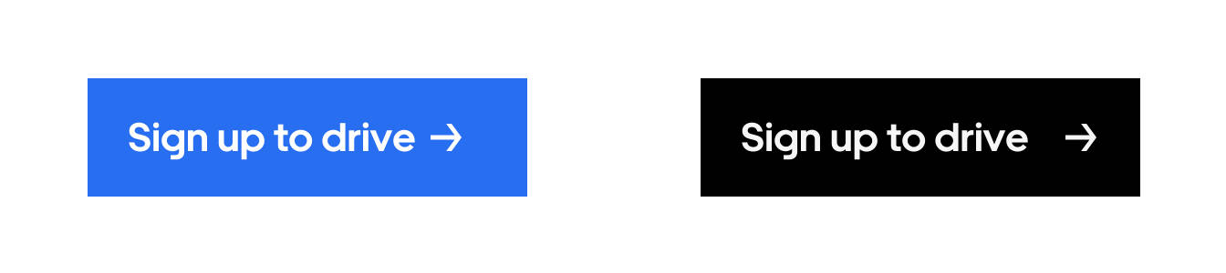
Calls to Action
There are 2 ways to create and identify call-to-actions for brand communications.
Use Uber Move Text Bold for Action and Uber Move Display Bold for Buttons.
Construction
Inactive & Hover/Active

Inactive & Hover/Active
Iconography should be treated like glyphs
within the typeface. Aligning typography with iconography should follow the same rules as partnership lockups. Whether for digital or physical mediums, allow for typography to
work in horizontal and vertical format.
- Vertical Lockup

- Horizontal Lockup

Imagery
Typography should either be black on
light imagery or white on dark imagery.
When aligned with the logo, typography
and logo should be the same color.
Light image / Dark image

Typography Guidance

- Do not use colored typography (black or white only)
- Do not use all caps
- Do not adjust kerning or tracking

- Do not make different levels of hierarchy the same weight
- Do not make any level of hierarchy the same size or scale as another
- Do not separate chunks of text
Typography Applications
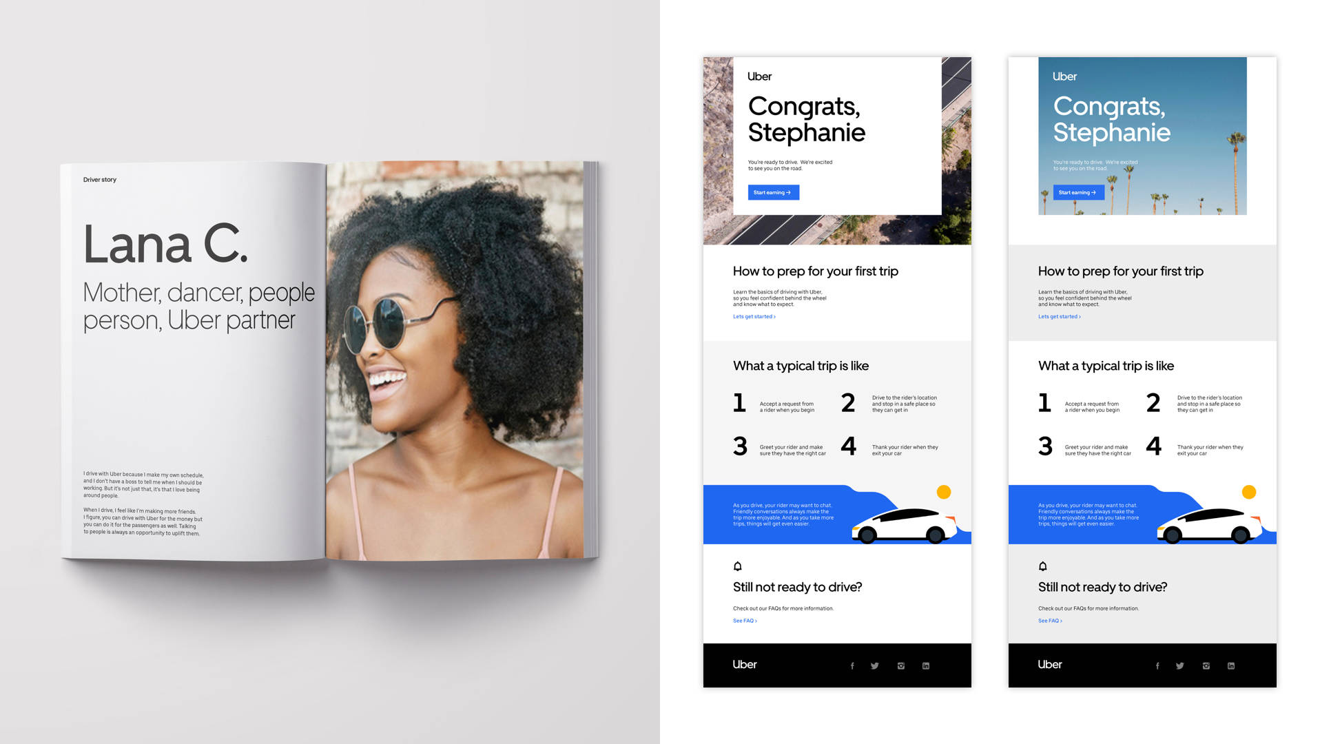
Driver guide & Email
Typography Summary
Our typeface is a pillar of our brand
Aim for contrast across type hierarchies