Color
Our colors take advantage of our existing strong—and globally positive—association with black.
A shift to more white and a manageable range of distinctive secondary and tertiary colors, lets our premium black continue to work for us while letting us embrace a lighter feel. We also have a distinctive blue to add tight focus on important moments.
Primary Brand Colors
Our primary brand colors are white and black. They are used to provide accessibility, simplicity, and consistency throughout all brand communications.
White
RGB — 0 0 0CMYK — 70 35 40 100HEX — 000000PMS — Black 6 C
Black
RGB — 255 255 255CMYK — 0 0 0 0HEX — FFFFFFPMS — White
Safety Color
Safety blue is an important color that is unique to Uber and should be used sparingly for moments of support, assurance, and delight at moments of interaction between a user and the brand.
Safety Blue

RGB — 39 110 241CMYK - 84 54 0 0HEX - 276EF1PMS - 2174 C, 3005 U
Secondary Colors
Our secondary colors pull from the colors of transportation. They should be used sparingly throughout illustration, photography, and product in order to maintain meaning and potency.

Uber green
RGB - 71 179 117CMYK - 93 0 63 0HEX - 47B275PMS — 2416 C, 3405 U
Uber Yellow
RGB - 255 192 67CMYK - 0 21 76 0HEX - FFC043PMS — 135 C, 121 U
Uber Red
RBG - 230 76 53CMYK - 0 82 80 0HEX - F25138PMS — 7417 C, 2347 U
Uber Brown
RGB - 153 00 77CMYK - 13 56 61 82HEX - 99644CPMS — 7525 C, 2021 U
Uber Orange
RGB - 255 125 73CMYK - 0 64 75 0HEX - FF7D49PMS — 164 C, 2018 U
Uber Purple
RGB - 115 86 191CMYK - 80 74 0 0HEX - 7356BFPMS — 2102 C, 2098 U
Usage Proportions
It is important to follow the rules of these proportions when creating any brand communication in order to maintain brand consistency and remain accessible for all people. White plays a very important role in all brand communications and should provide balance with black. Safety Blue is only used for critical moments that warrant care between Uber and the user. The secondary colors are only used reasonably for illustrations and within product.
Specialty Colors
The specialty colors are designated only for illustrations that require tone-on-tone pairings and product designs that require variations of tone and opacity.

Color Guidance
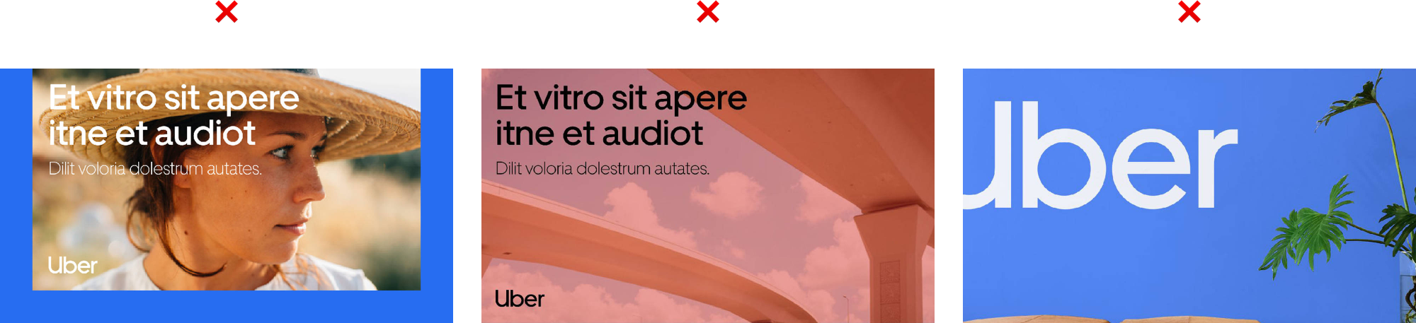
Improper use of Safety Blue (U-frame compositions)
Color effects or creating new colors
Do not cover surfaces with Safety Blue
Using too many secondary colors (in one composition)
Wrong color proportions
Text should never be colored
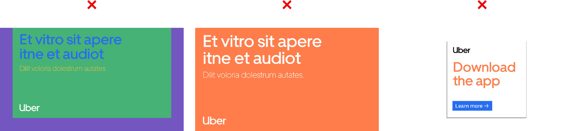
Color Applications
Ways to incorporate color

Color in photography
Color in illustration
Typographic compositions
Action
The use of color depends on the communication.

Safety
The use of Safety Blue depends on the communication.
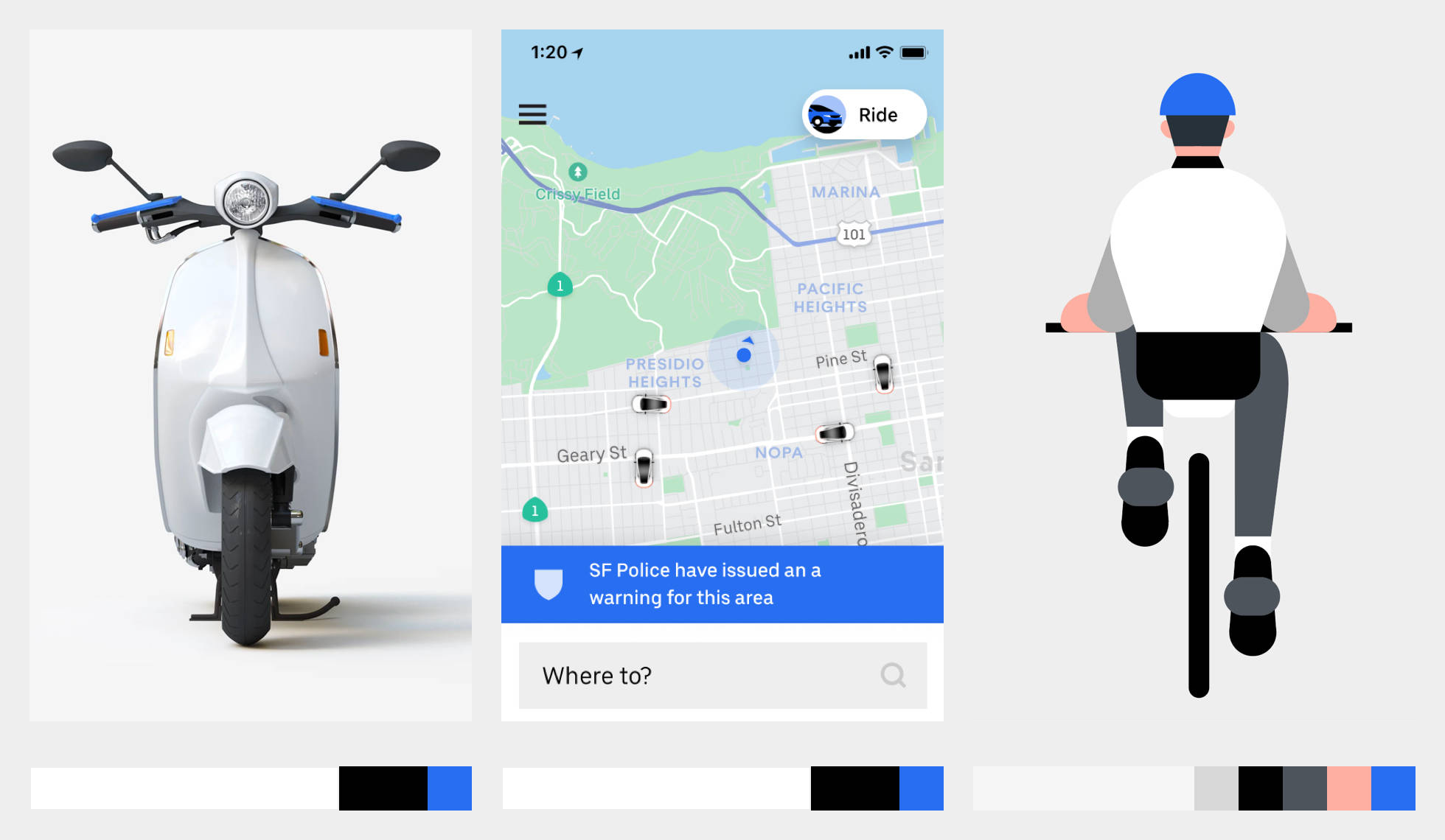
Product
(Illustrative purposes only)
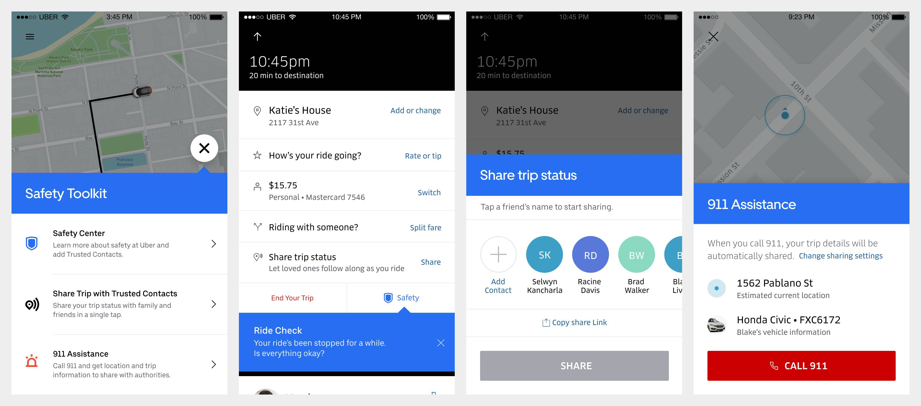
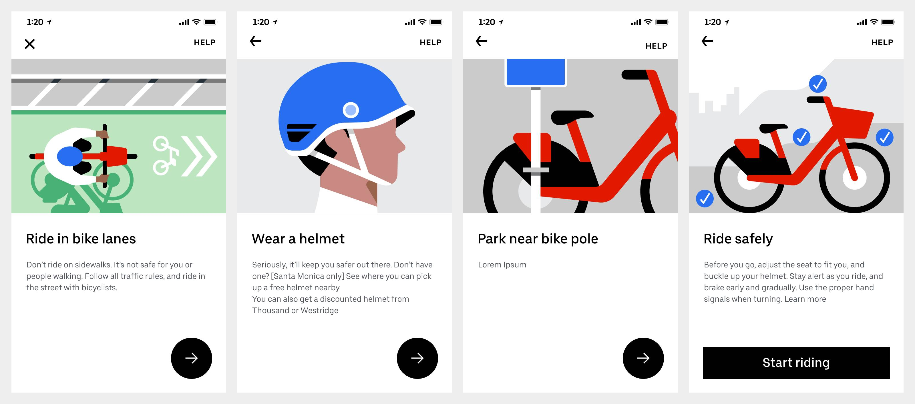
Safety toolkit
Ride check
Share your location
911 assistance
Safety Onboarding
Color Summary
Embrace the power of black and white
A little blue goes a long way
Bring in color through imagery
Our secondary colors should be used sparingly